
Cork's Red Clover Farm
Packaging redesign and brand refresh for Cork’s Red Clover Farm, who were preparing to launch their first product range but felt their original packaging didn't feel premium enough. We simplified the logo and redesigned the packaging using a red clover cut-out on the front as a focal point. All colours were drawn from the photograph to create an elegant, nature inspired look with subtle pink and green accents and a refined gold detail on the front. Since launch, Cork’s Red Clover Farm has been very successful, building a clear and recognisable presence.
Project Description
Sinéad from Cork’s Red Clover Farm approached us ahead of her brand launch. While her products were carefully developed, the original packaging didn’t feel premium and risked undermining the quality of the products.
The goal was to create packaging that felt elegant, natural, and refined, giving the brand a strong visual identity while remaining approachable and grounded in its Cork origins.
The focus was on the two main products at launch (Tea and the 2-in-1 cream) with clear brand guidelines for their in-house designers so future products could maintain consistency and clarity.

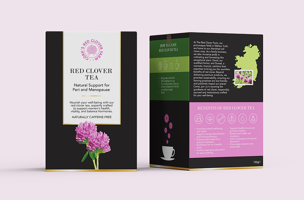
Cork's Red Clover Farm Tea Design
"Absolutely brilliant service! My branding was perfect for my new brand and Tatiana brought the whole lot to life . Highly recommend!"
Sinead -
The Design
The original packaging relied on a black and gold scheme that felt heavy and disconnected from the natural, Irish origins of the brand. The redesign kept a black base for structure and contrast, but introduced a white framed panel on the front to improve clarity and readability.
A red clover cut-out was used as the central design element, and all colours on the packaging were drawn from this image. Pink, dark green, and light green, creating a palette that feels natural and harmonious. A subtle gold accent was added around the front panel to provide a hint of refinement without feeling over the top.
The logo was originally in multiple colours, but we recommended simplifying it to a single pink colour, giving it a more premium, consistent, and recognisable identity across products.
The design approach was then applied to the 2-in-1 cream packaging, and guidelines were provided for future products, making it easy for the in-house designer to maintain consistency across the growing product line.

Cork's Red Clover Tea Packaging Design
The Result
The redesigned packaging transformed Cork’s Red Clover Farm into a brand that visually reflects the quality of its products. The use of the red clover cut-out, natural colour palette, and subtle gold detail created a packaging system that feels elegant and premium.
The brand launched at the Cork Summer Show and was a great success, with most products selling out and customers complimenting the packaging and overall brand. Since then, Cork’s Red Clover Farm has continued to expand its product range while keeping a consistent, recognisable identity, helping it make a strong impression in the market.
Explore more projects

